Here is a youtube link to our finished film trailer:
Monday, 19 April 2010
Magazine ideas and the final product
 On the left is a draft copy of our poster in progress. The photograph is of "the baddy" in the trailer. We chose to use him for the photograph because on other magazines we analysed, the majority use the criminal as a main character to interview.
The title of the magazine is written in bold so that the audience can quickly see what they are reading. Layering was used to overlap the photograph with the title so that it didn't look so rigid and like everything was just placed without thought.
Where it says "Top films of '10" there will be a list below. This will act as a preview of what to expect in the magazine. This is the same for the wrtiting at the bottom about Hugh Grant and Brad Pitt.
After looking at this, we decided that the colour needs to be changed to red in order to tie in with the rest of the products we have made.
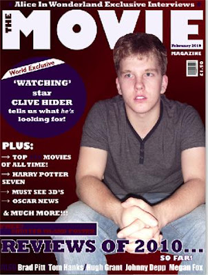
 On the right hand side is a copy of the final poster. As you can see we have changed the background theme to red. The blue circle at the top is the main part which says about the our film. It tells you what it is called and also who actor in the film/front cover is.
 Underneath this, there is a list of articles you will see in the magazine. This has been added in so that it looks like a magazine and not just another poster.
As well as this, we have stuck with the typical conventions by writing the date at the top, a barcode and a price.
This has been made using Adobe photoshop. Techniques used, include layering of the photo and words written within the title. The actual photograph itself was part of a bigger picture, so alot of time had to be spent using the 'lasoo' tool to cut him out. After this, he had to be reshaped using the 'rubber' tool, otherwise the edges wouldn't have been smooth.
On most of the magazines we analysed, there was a background image linking in the character and the film, instead of just a colour block. We chose to challenge this convention. After experimenting with photos behind, we decided that they made the page looked too busy, so we settled for a plain background. As a whole this looks more effective.
How effective is the combination of your main product and ancillary texts?

Here are all three of the products we have produced. We have linked all of them together by using a red theme throughout. The actor in the magazine, is featured in the film and also is written on the poster so you know who he is.
As a group we chose the colour red as it gives connotations of evil. The way that the colour runs throughout is very effective to us and to the viewre becasue it is consistent and gives the product as a whole a theme.
Subscribe to:
Comments (Atom)

